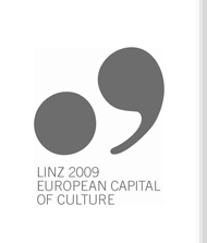
The Logo
The Linz09 logo was the result of an open competition. The requirements for the logo were threefold: it had to express the self-perception of the future Culture Capital as a European cultural festival; guarantee a memorable, terse presence in a variety of contexts; and offer scope for playful variations. On the basis of more than 540 designs submitted by agencies, graphic artists, graphically inclined laypersons and students in spring 2006 six artists were asked to present a more detailed elaboration of their first drafts. Thomas Maier’s proposal was awarded the First Prize by a unanimous decision of the jury:
What commended Maier’s logo in the eyes of the jury was its light-heartedness, its sophisticated conspicuity and its basic attitude of joyous playfulness, which was felt to be in keeping with Linz09’s cultural message. His basic elements were a typographically oversized full stop and a comma, suggesting in their reduced forms the ciphers 09. It was possible to use these elements either on their own or together with text elements. In positive print its basic colour is medium grey, versions in black and white were added at a later stage.
The versatility of the logo was such that it could be used in a great number of variations and figurations in the most diverse contexts and narratives. It lent itself to many different uses by offering the possibility of replacing the full stop by other circular pictorial elements. In the context of tourism the Linzer Torte proved particularly popular. In this way, pictorial elements traditionally associated with Linz effortlessly became part of the Culture Capital’s visual presence. In a manner that mirrored the artistic freedom of Linz09’s cultural mission, minimal interventions sufficed to put the logo through its paces to satisfy all conceivable demands; even after three years of intensive deployment the Linz09 logo is showing no trace of wear and tear.
back


